What is the International Typographic Style (ITS)?
The International
Typographic Style (or the Swiss Style) had started in Switzerland and Germany during
the 1950s. The objective of this movement was for the clarity of design, and
the International Typographic Style had remained to be a major force for over
two decades and its continues into the twenty-first century.
The visual
characteristics of the ITS includes the unity of design achieved by
asymmetrical organisation of the design elements on a mathematical constructed
grid. The ITS made use of objective photography and copy the present visual and
verbal information in a clear and factual manner, that was free from the
exaggerated claims of propaganda and commercial advertising and the use of
sans-serif typography set in a flush-left and ragged-right margin
configuration. The initiators of this movement believed that the sans-serif
typography expresses the spirit of a more progressive age and that mathematical
grids are the most legible and harmonious means for structuring information.
The pioneers of
the ITS had defined design as a socially useful and an important activity.
Personal expression and eccentric solutions were rejected, while a more universal
and scientific approach to design problem solving had been embraced. In this
paradigm designers defined their roles not as artists but as objective conduits
for spreading important information between components of society.
Exercise 1. Logos that represent the principles of
the International Typographic Style.
In our current
day and age there are essential aspects of the ITS that are still present in
design some magazine layouts, logo design, and public signage today still make
use of a grid system. This is that there can be easy recognised be people
universally.
Here we shall
view some logos that still hold these principles. Firstly there’s the use of
sans-serif type in the logos. Sans-serif type helps give a logo a clean look
and it allows for easy readability. It’s not uncommon to find a logo with a
serif typeface, but only if it fits the design and reflects the purpose of the
service that logo is representing.
Simple graphics
or symbols are also used in these logos as they help make the logos easily
recognisable with both shape and colour. The colours used in logos can invoke
certain feelings in person for example the McDonald’s logo uses yellow on red
to grab a viewer’s attention and to invoke the feeling of hunger, thus making
them crave food from McDonald’s.
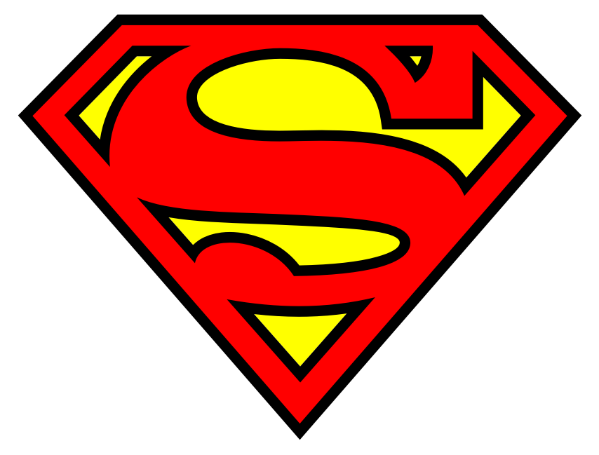
The Superman
logo is another good example of how colour is used in logo design. The Superman
logo uses red on yellow. The red in the logo can represent strength and
confidence, which are the qualities that Superman possesses. The grid system is
also applied so that most logos can fit in a square like format, so they can be
easily scaled up or down in size for print.
The logos that
I like the most are the Cartoon Network; Pick ‘n Pay; Quiksilver; Citroën, and
the McDonald’s logos. They follow a clean look and are easily recognisable and
memorable. As mentioned earlier there’s use of colour as it can affect the way in
which one views the logos. For example, most of these logos make use of the
colours: black, red, some contain blue. Red is energising, signifies leadership
qualities, determination, strong will, and gives confidence to those who are
shy or lack confidence. The colour blue invokes the feelings of trust, honesty,
loyalty, and relief.
Image links:
Cartoon
Network:
Toyota:
McDonald’s:
No comments:
Post a Comment